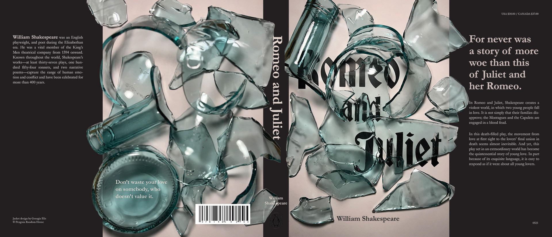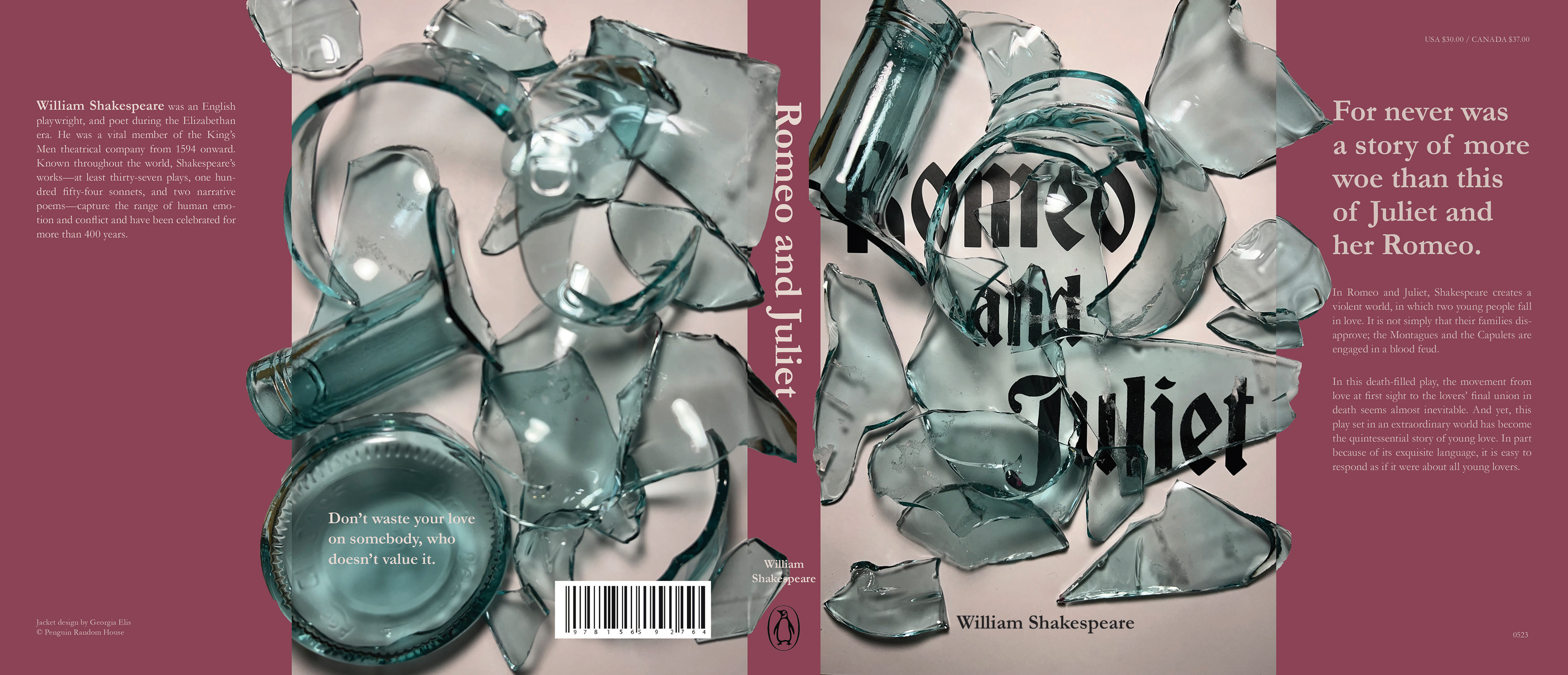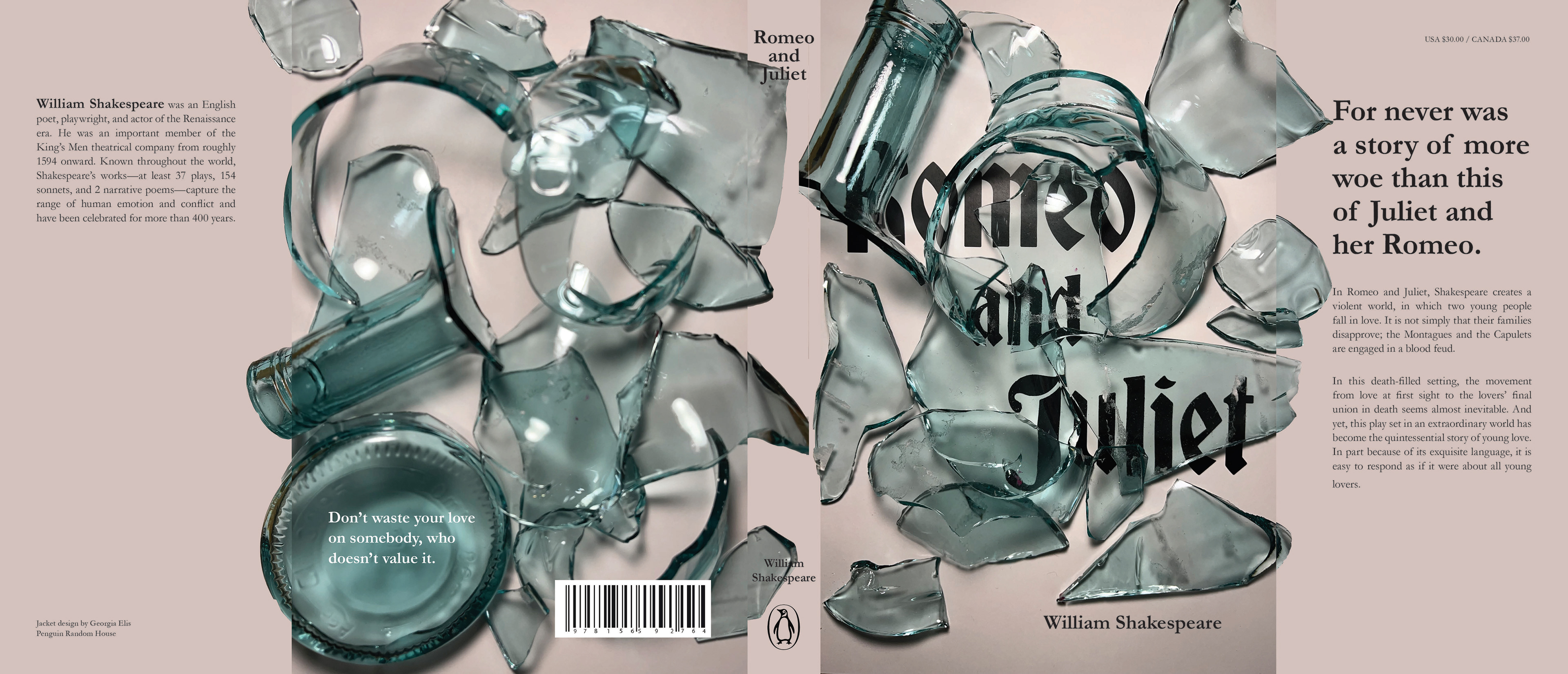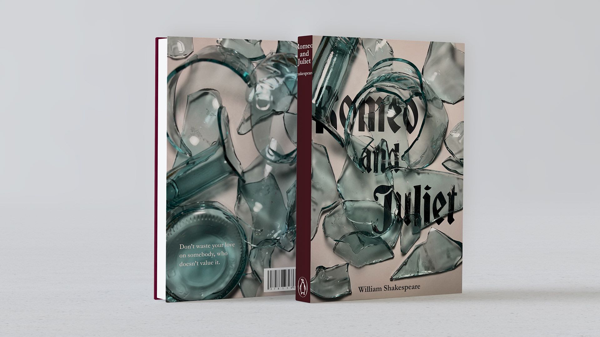
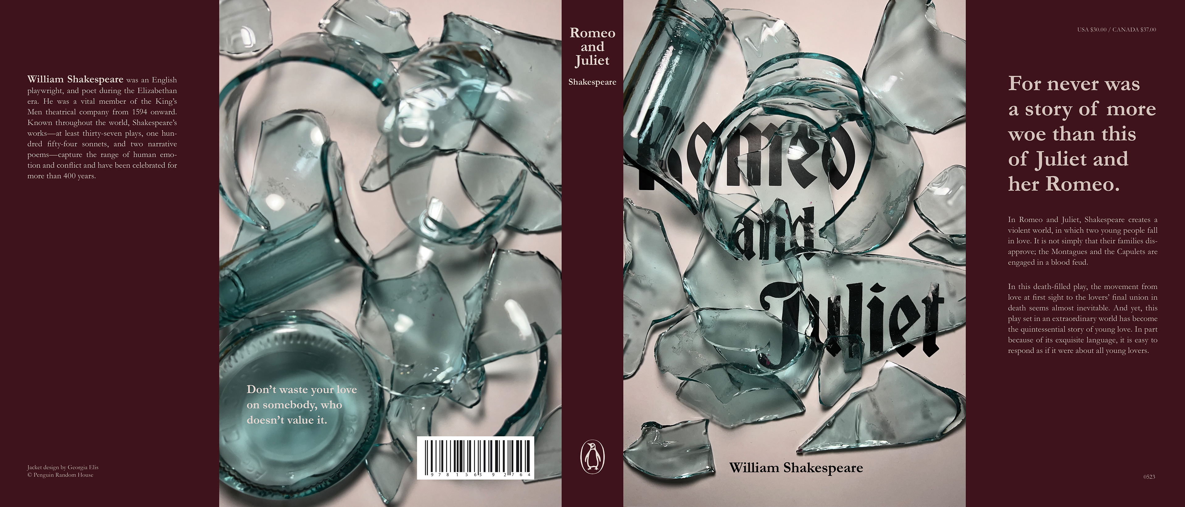
This was an assignment for my Type 2 class. We were tasked with creating book covers for a novel using three-dimensional type design. For Romeo & Juliet, I wanted to emphasize the fragility of their relationship and the destruction and violence that it caused to themselves and the people around them.
Process
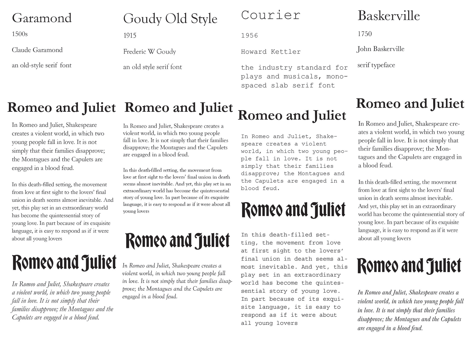
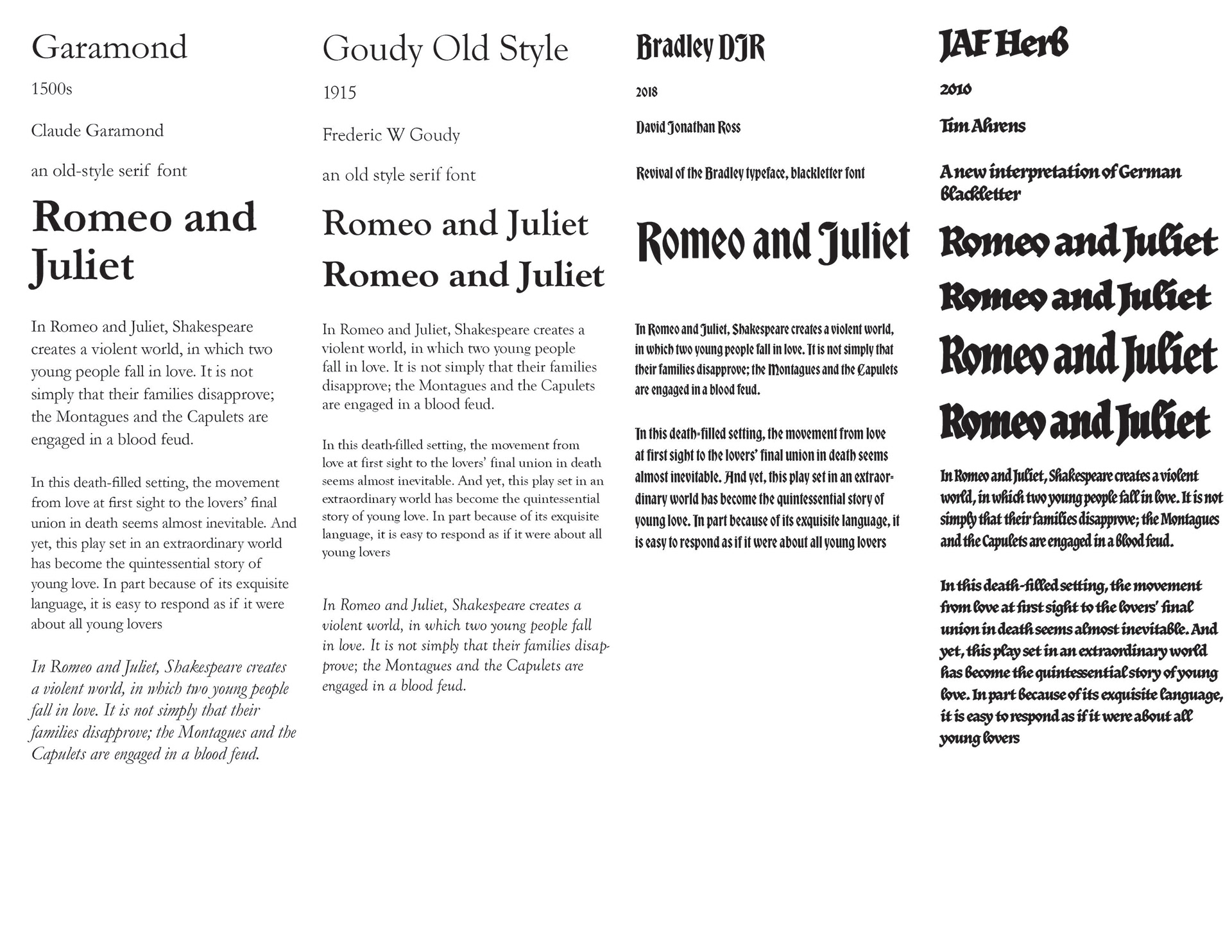
I wanted to work with a typeface that was reminiscent of what Romeo & Juliet would have been originally printed in and a blackletter typeface that was common in the 1500s. After experimenting with different typefaces, I decided to use Garamond and Bradley DJR.
I made three-dimensional type using lipstick and a mirror, lipstick and burned letters, leaves and paper, and a broken glass bottle.
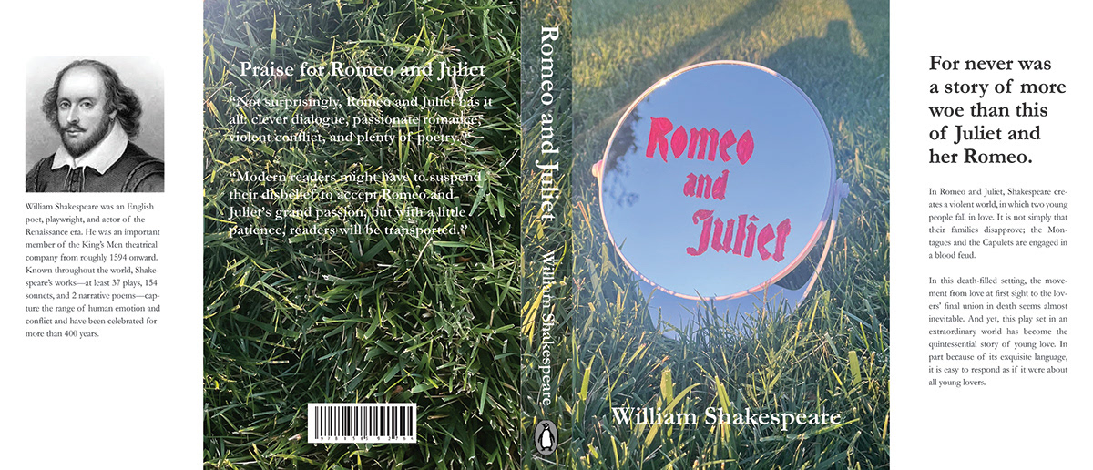
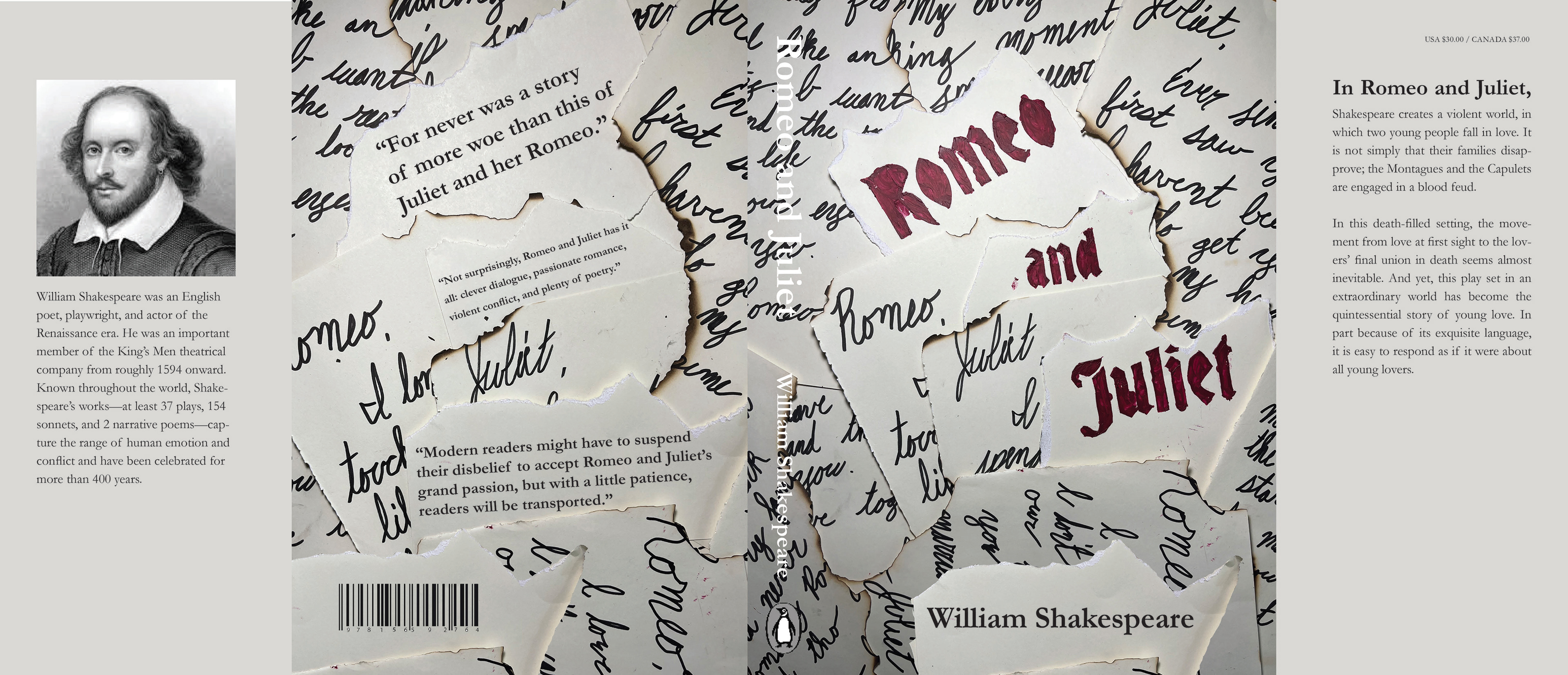
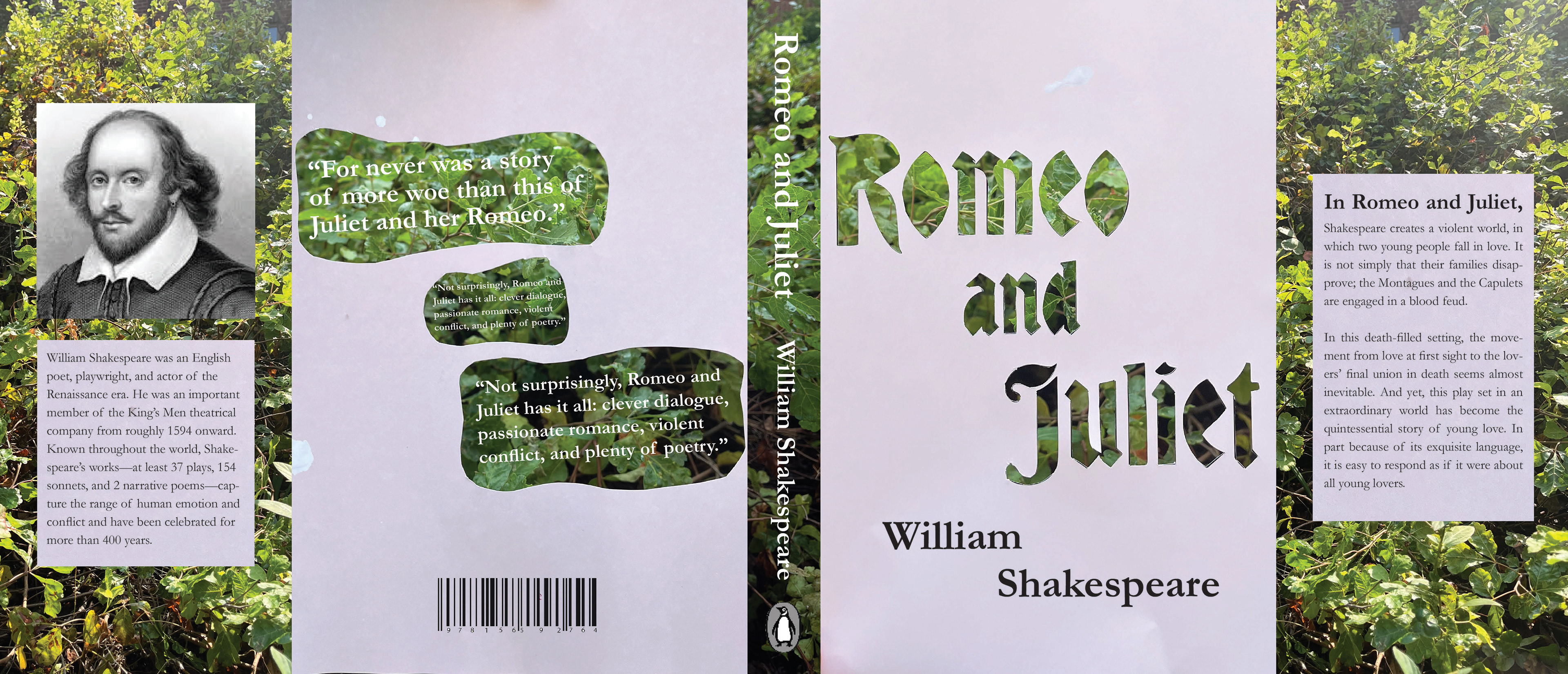
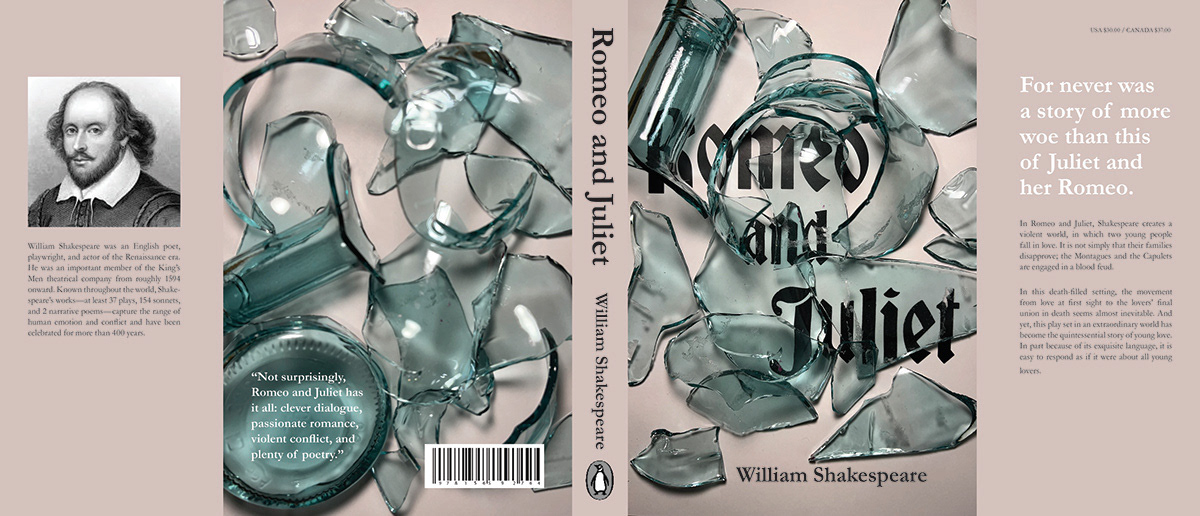
I focused on the broken glass bottle imagery because it exemplified the fragility of their relationship and the violence that ensued. I tested out colors, having the glass wrap across the flaps and spine, and spine layouts. I took out the image of Shakespeare because it didn't fit with the visual style. The color I chose for the flaps and spine came from the lipstick color I used for the previous drafts.